Asymmetric aspects of log response ratios (or please use response ratios in your figures!)16/10/2014 Log response ratios are frequently used as size effects in ecological meta-analyses, primarily because they are normally distributed around zero. This is an important attribute, as a size effect with a value of zero represents no difference between the groups being compared (e.g., treatment vs. control). Furthermore, it facilitates the use of meta-analytical tools , such as meta regression, that i) assume normality and ii) require sampling variance. While textbooks frequently recommend presenting back-transformed log response ratios, the rationale for doing so is not usually provided. Most importantly, I think it is important to explore this issue to improve how figures are interpreted by readers. I have seen log response ratios presented in some meta-analyses and, as you will see shortly, they can be misinterpreted easily - especially when comparing effect sizes across different experimental treatments. To make these issues more clear, I created some fake data and made some illustrative figures. In the figure below, I calculated log response ratios and response ratios using the same data (treatment values ranged sequentially from 1 to 100 and the control value was fixed at 50). If the blue line were straight, this would mean that log response ratios increase or decrease at the same rate as that of the response ratio. However, the blue line shows that the log response ratio becomes negative faster than positive (compare the end points of the curve). What does this mean? If one were to compare two treatments, one with a negative log response ratio and the other with a positive log response ratio, one would conclude that the treatment with the negative log response ratio had a stronger effect than the treatment with a positive log response ratio. This could be 'true' provided that the values of the log response ratios are low ( i.e. between -1 and 1), but would become increasingly less true the larger the effect size. 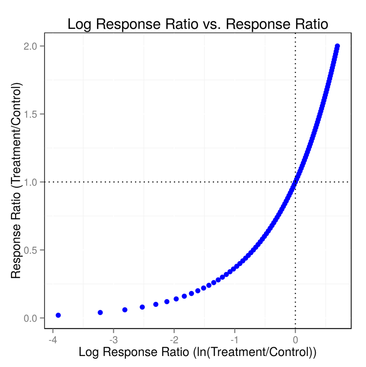
To avoid such misinterpretations, one should present results using the response ratio (just like the textbooks say!). The advantage of doing so is straightforward: a unit increase with respect to the control has the same effect on the response ratio as a unit decrease. To illustrate this, I created a fake data set with two treatments, one that increased one unit sequentially with respect to the control and the other that decreased by unit with respect to the control. Thus, we have 10 pairs of observations that each differ the same amount with respect to the mean but in opposite directions (e.g. control = 5, treatment a = 6, treatment b = 4). I plotted the response ratios for the 10 pairs of observations and we can clearly see that the 10 points form a nice, straight line (see figure below). 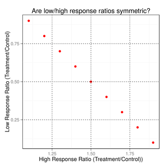
This figure illustrates the utility of presenting results using response ratios: they enable one to fairly compare the magnitude of effect sizes across treatments.
I would like to thank Forest Isbell bringing this to my attention during our workshops this past week at iDiv.
26 Comments
|
 RSS Feed
