Brief introductionRecent advances in meta analysis, such as mixed effects and structural equation models, allow ecologists to tackle increasingly more complex questions. Visualizing these results, however, is not straightforward. In a previous post, I described how to set up the data set and how to analyse it using a meta-analytical mixed-effects model. Here, I will briefly show how to graph results of bi-variate random effects model using ggplot2 and metafor. I strongly recommend that users thoroughly read Wolfgang Viechtbauer’s web site on meta-analysis in R, which has a lot of useful information about common problems in meta-analysis. For graphing results from ‘normal’ mixed effects models check out a) Ben bolker’s FAQ and b) Lionel Hertzog’s blog Getting startedInstall and then load packages:
For this tutorial, we’ll be using data from the Curtis database on plant responses to elevated C02. To save space and not to replicate code from the previous post, I’ve uploaded the data to Dropbox Load the data
Fit candidate models
Model summary
Set up the prediction matrixThis step creates a data frame with predicted values from the random effects model,
Make the graph!One of the nice features about the ‘predict’ function in metafor is that it allows for plotting either confidence intervals or prediction intervals
Additional thoughts One can also graph separate lines and adjust other parameters , e.g.,point size, shape, and color,
Here’s an example:
To select colors that will look good on a printed page, check out Colorbrewer2 To adjust shapes and linetypes, check out this the R cookbook Adjust ggplot2 theme parameters
The size and resolution can be adjusted to make publication-quality figures
Now admire your hardwork!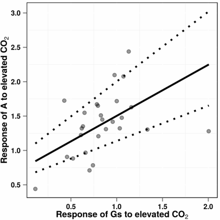
|
 RSS Feed
